AI-Powered Short-Term Rentals & Property Management
AI-Powered Short-Term Rentals & Property Management
Hilobi
Hilobi


Overview
Hilobi is a short-term B&B rental company that offers access to innovative, fully-furnished apartments in prime urban locations. These stays are intuitively designed to provide leisure travelers and business professionals with authentic and immersive stays.

Overview
Hilobi is a short-term B&B rental company that offers access to innovative, fully-furnished apartments in prime urban locations. These stays are intuitively designed to provide leisure travelers and business professionals with authentic and immersive stays.

Problem
NEEDS:
Mobile Application Design - An intuitive, user-friendly app to accommodate B&B guests in order to become a go-to choice for tailored, short-term B&B accommodations.
Brand Design - Conveying a sense of 'a better home away from home'.
Solution
AS PRODUCT DESIGN LEAD, I DELIVERED:
iOS App Design with seamless booking experience
AI Chatbots with integrated Conversational AI for guest interaction
Visual Brand Identity with full and comprehensive Usage Guidelines
Process
The process involved in the design of the Hilobi App was extensive.
COMPETITIVE ANALYSIS

Competitive Analysis
After holding several discovery meetings with the Hilobi team, I conducted research in order to gain a deeper understanding of the short-term rental & hospitality space and Hilobi's potential direct and indirect competitors. I then replicated the booking process of 3 most adjacent brands through interactive prototypes and queued them in for a round of user testing. Additionally, I designed visuals to effectively discuss the attained data, as related to the brand's goals and aspirations.
USER TESTING - ROUND 1


User Interview Questions Excerpts
I developed specific groups of non-leading, qualitative & quantitative questions and listened back to responses from multiple individuals who had varying experiences with booking short-term stays.
USER PERSONAS


User Personas
After conducting initial user research through interviews and surveys, I gained an understanding of the Hilobi's user types and was able to generate personas based on their commonalities and differences.
USER FLOW

User Flow
It was important to get a sense of the user's journey throughout the application. The goal here was to make the experience as effortless as possible, while maintaining commonalities found on familiar booking platforms. The integration of Conversational AI was designed to take the user's overall experience to an even deeper level of trust and comfortability.
WIREFLOW
Initially, the wireflow started off as a digital card-sorting exercise among Hilobi's product team. We were able to strategically prioritize orders of operation and tasks for the app's users along with gaining alignment on hierarchy of feature importance and integration.
WIREFRAMES
I produced the app's wireframes in Figma, utilizing an array of tools and techniques.
LO-FI PROTOTYPE
As best practice, a lo-fi prototype is my preferred initial run before the final. I produced the lo-fi prototype for the Hilobi app, indicating key areas of emphasis through the use of contrast and sizing.
USER TESTING - ROUND 2
Utilizing user testing tools like usertesting.com was helpful in getting intuitive design ideas in front of actual potential app users. The results guided me into the right direction to completing an initial lo-fi prototype for the app.
BRAND SKETCHES

Preliminary Logo Mark Sketches
As it became time to design Hilobi's Visual Brand Identity, I started with sketching out multiple symbols that aligned with the brand's overall tone and messaging.
VISUAL BRAND IDENTITY

Hilobi Icon & Word Mark

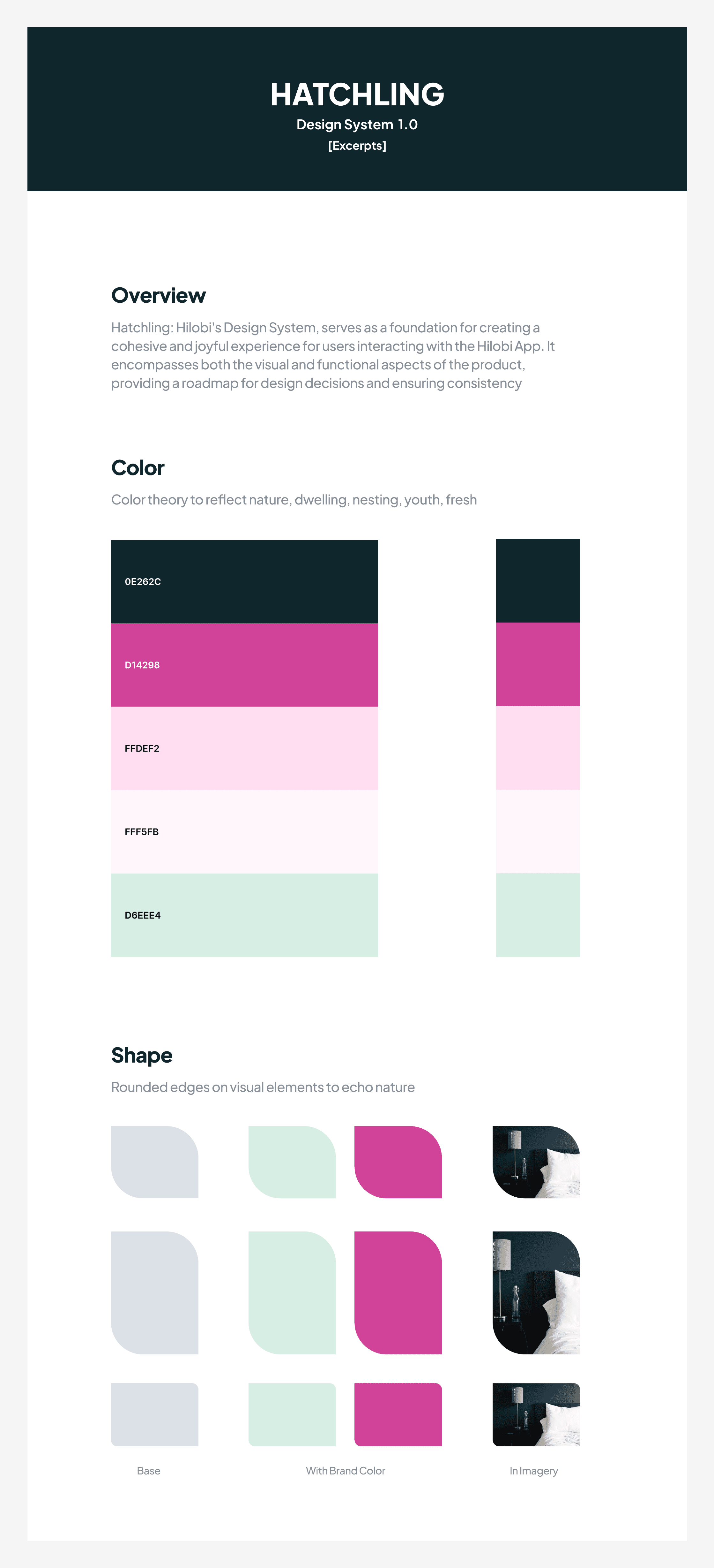
Design System Excerpts
Once the final sketch iterations and aesthetic was approved, I refined the visual brand aesthetic by solidifying branded elements and initiating brand usage guidelines.
HI-FI PROTOTYPE

Hilobi App Hi-Fidelity Prototype
Lastly, I produced a high-fidelity prototype for the Hilobi App, complete with implementation of the new branding and full documentation in order for developers to work with it, seamlessly.
View Prototype ->
Results & Highlights
100% Task Completion
In prototype testing, a diverse group of 12 participants successfully navigated and completed booking tasks within allotted time constraints, indicating the prototype's efficiency, effectiveness, and user-friendliness. This positive outcome suggests the system's potential to meet real-world demands and provides confidence in delivering a seamless user experience in future iterations.
High Chatbot Engagement
The Conversational AI Chatbot received positive feedback, demonstrating strong user engagement with a projected rate of 95% based on user tests. This indicates that users found the chatbot effective and appealing, showcasing its ability to interact seamlessly and meet user needs successfully.
Projected ML Recommendation Accuracy
After collecting feedback and testing our prototype, Hilobi's recommendation system, powered by machine learning, is expected to reach an impressive 93% accuracy. This conveys the system to be highly effective in suggesting content that users are likely to enjoy, making Hilobi a more user-friendly and satisfying platform.
Positive Brand Design Feedback
Positive response in user groups indicated a strong alignment with the 'home away from home' ethos, suggesting the potential for increased brand affinity post-launch.
Conclusion
This journey with Hilobi demonstrated how the creation of a centralized, user-focused design could ramp up user engagement in the BnB space. I dove deep into understanding what the app's users – both guests and hosts – truly need. More than just numbers, the resulting achievements of thorough prototype iterations and testing reflects my commitment to making Hilobi, the choice for tailored, short-term stays. It's been an incredible experience to create such a positive ripple in the way people travel and connect.
Final Prototype
View Prototype ->
Problem
NEEDS:
Mobile Application Design - An intuitive, user-friendly app to accommodate B&B guests in order to become a go-to choice for tailored, short-term B&B accommodations.
Brand Design - Conveying a sense of 'a better home away from home'.
Solution
AS PRODUCT DESIGN LEAD, I DELIVERED:
iOS App Design with seamless booking experience
AI Chatbots with integrated Conversational AI for guest interaction
Visual Brand Identity with full and comprehensive Usage Guidelines
Process
The process involved in the design of the Hilobi App was extensive.
COMPETITIVE ANALYSIS

Competitive Analysis
After holding several discovery meetings with the Hilobi team, I conducted research in order to gain a deeper understanding of the short-term rental & hospitality space and Hilobi's potential direct and indirect competitors. I then replicated the booking process of 3 most adjacent brands through interactive prototypes and queued them in for a round of user testing. Additionally, I designed visuals to effectively discuss the attained data, as related to the brand's goals and aspirations.
USER TESTING - ROUND 1


User Interview Questions Excerpts
I developed specific groups of non-leading, qualitative & quantitative questions and listened back to responses from multiple individuals who had varying experiences with booking short-term stays.
USER PERSONAS


User Personas
After conducting initial user research through interviews and surveys, I gained an understanding of the Hilobi's user types and was able to generate personas based on their commonalities and differences.
USER FLOW

User Flow
It was important to get a sense of the user's journey throughout the application. The goal here was to make the experience as effortless as possible, while maintaining commonalities found on familiar booking platforms. The integration of Conversational AI was designed to take the user's overall experience to an even deeper level of trust and comfortability.
WIREFLOW
Initially, the wireflow started off as a digital card-sorting exercise among Hilobi's product team. We were able to strategically prioritize orders of operation and tasks for the app's users along with gaining alignment on hierarchy of feature importance and integration.
WIREFRAMES
I produced the app's wireframes in Figma, utilizing an array of tools and techniques.
LO-FI PROTOTYPE
As best practice, a lo-fi prototype is my preferred initial run before the final. I produced the lo-fi prototype for the Hilobi app, indicating key areas of emphasis through the use of contrast and sizing.
USER TESTING - ROUND 2
Utilizing user testing tools like usertesting.com was helpful in getting intuitive design ideas in front of actual potential app users. The results guided me into the right direction to completing an initial lo-fi prototype for the app.
BRAND SKETCHES

Preliminary Logo Mark Sketches
As it became time to design Hilobi's Visual Brand Identity, I started with sketching out multiple symbols that aligned with the brand's overall tone and messaging.
VISUAL BRAND IDENTITY

Hilobi Icon & Word Mark

Design System Excerpts
Once the final sketch iterations and aesthetic was approved, I refined the visual brand aesthetic by solidifying branded elements and initiating brand usage guidelines.
HI-FI PROTOTYPE
